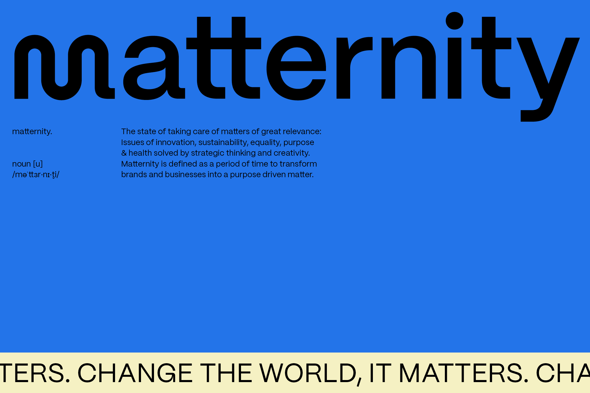
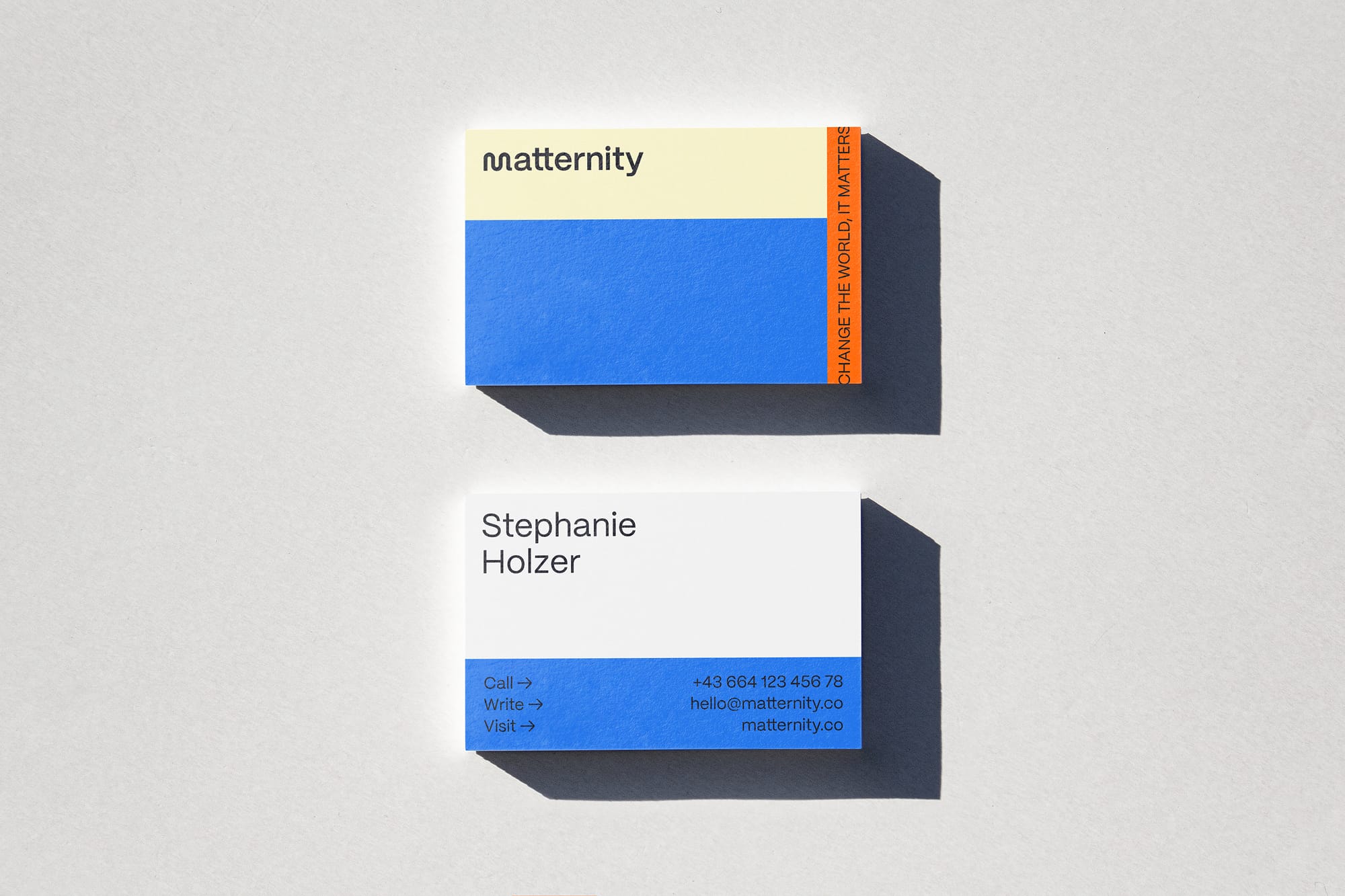
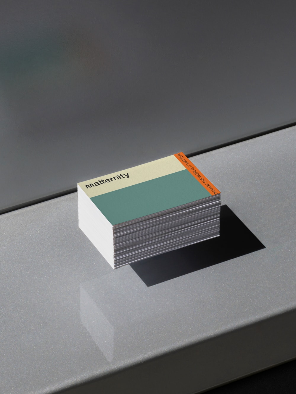
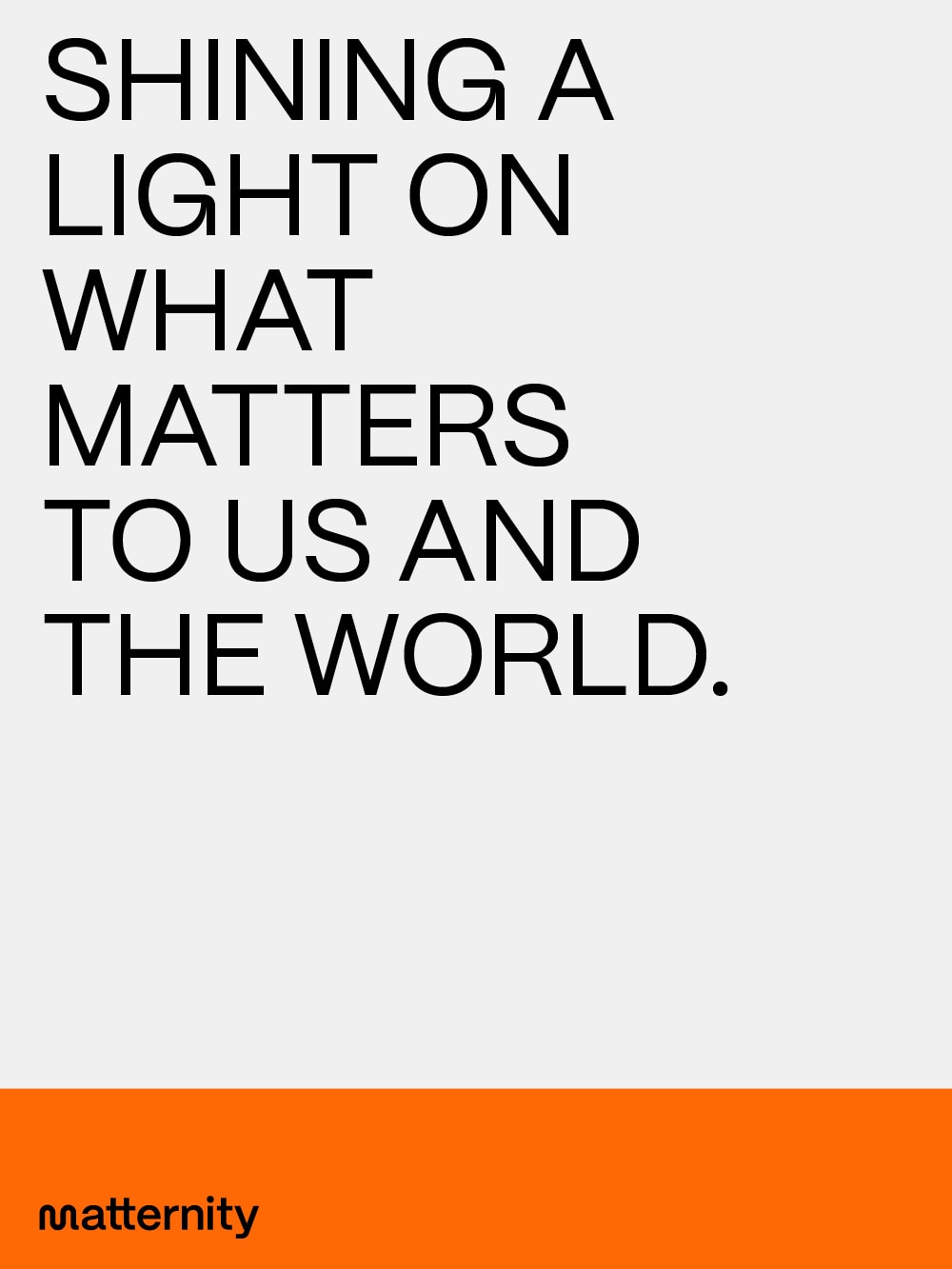
Matternity
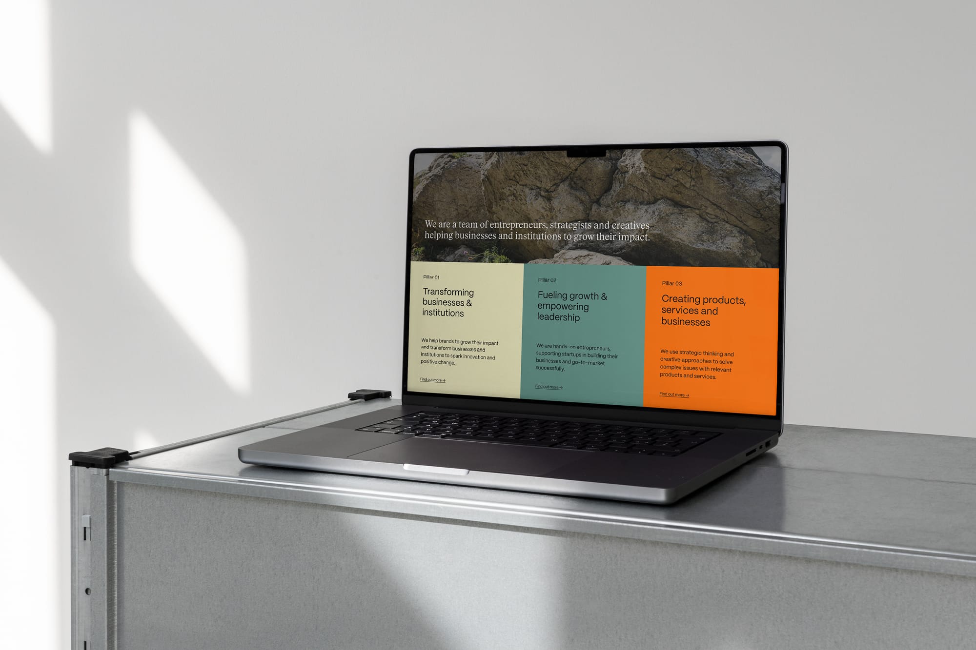
The consultancy »Matternity« stands for big ideas, new ways of thinking, and a clear vision to develop creative concepts that transcend traditional consulting—creating positive changes for brands, businesses, and society. This clarity is reflected in the simple logo: the customized »m« signifies the beginning of something new. Standing alone, it serves as a logomark; in its continuous form, it becomes a guiding element that emphasizes Matternity's forward-thinking mindset and readiness for change. The typography draws strength from the selected sans serif's strong presence and sophisticated details, inspired by contemporary Japanese design.
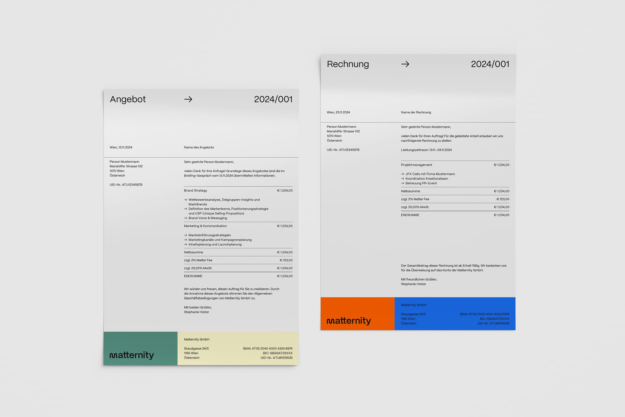
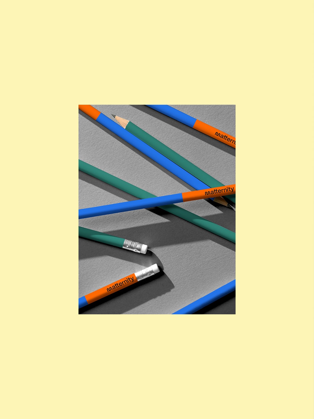
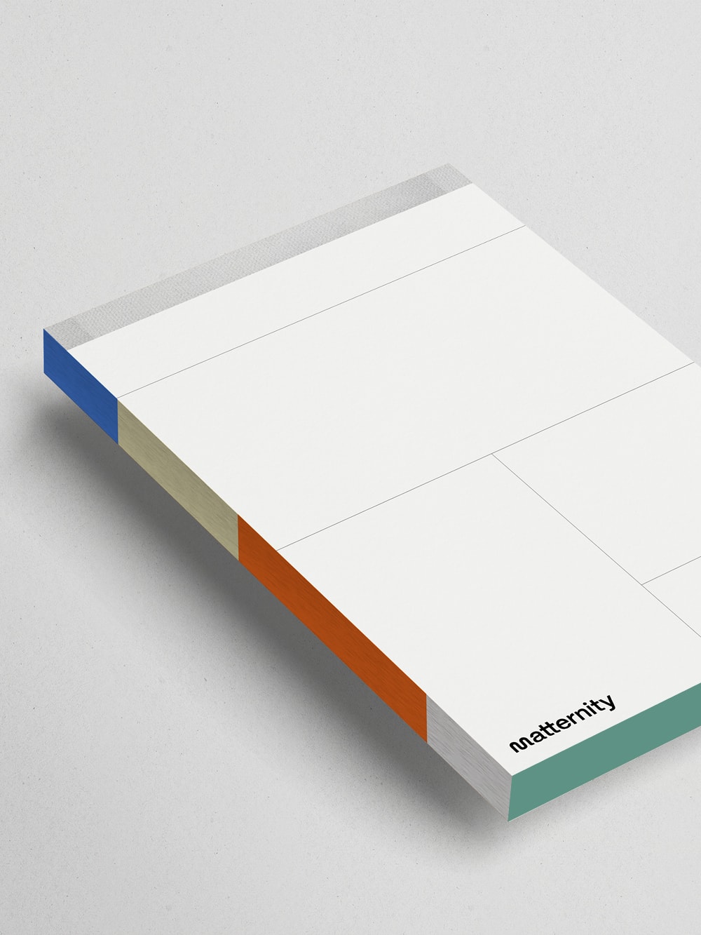
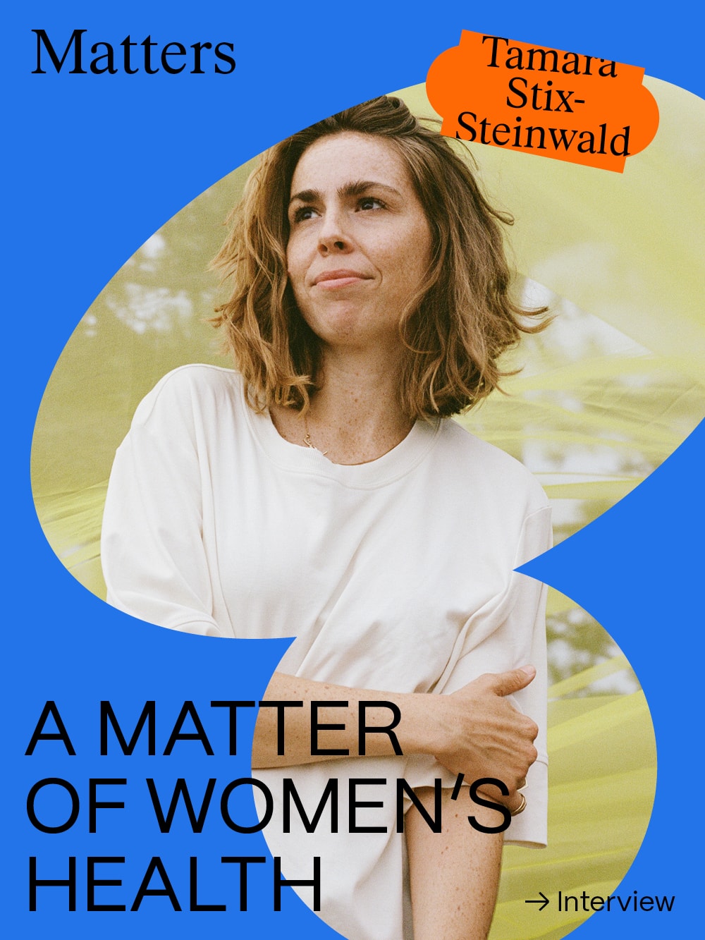
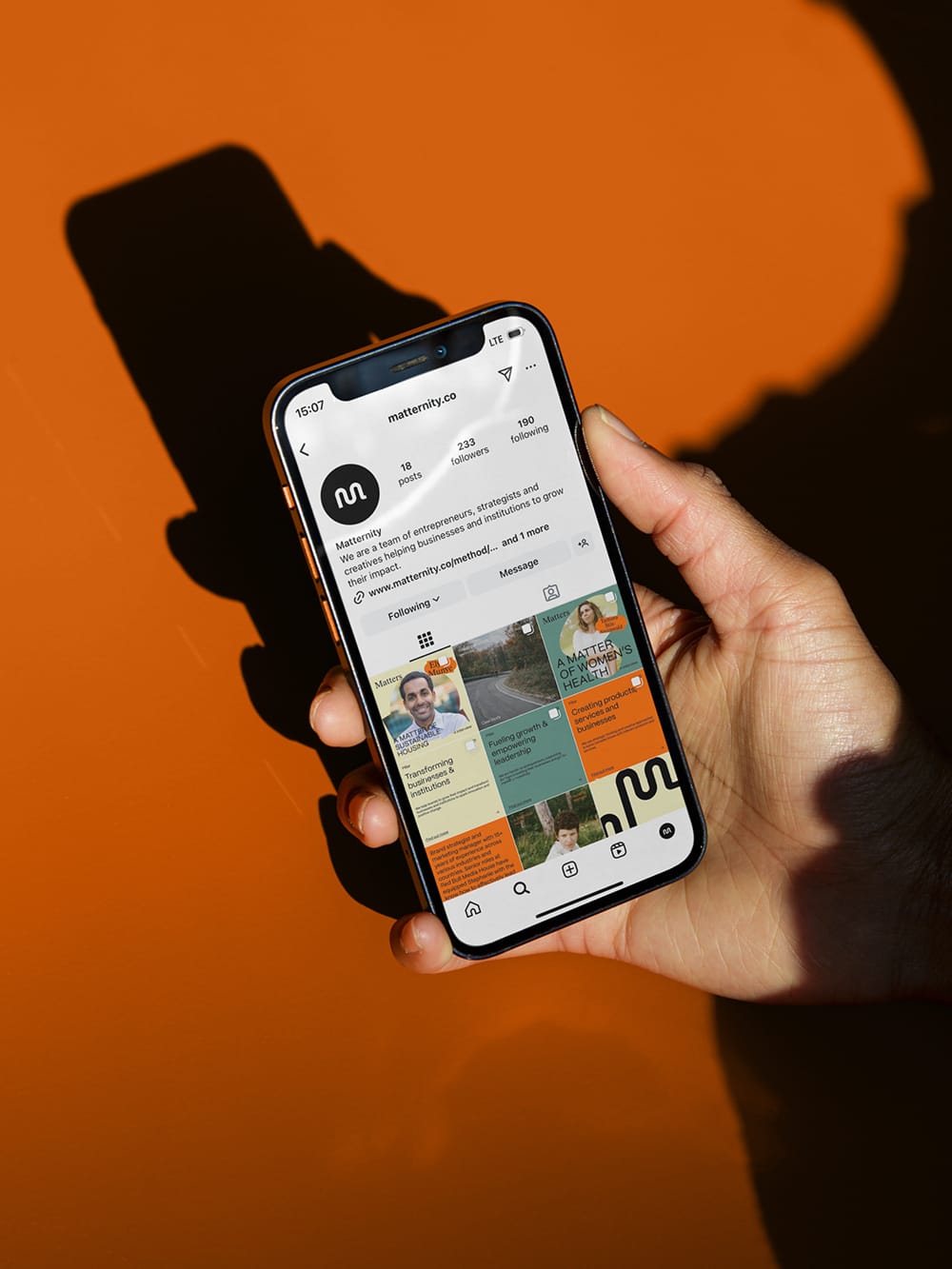
A modern color-blocking system flows throughout the design, highlighting Matternity's unique approach and strategy toolkit. Digital elements, such as an animated marquee, create space for current and prominent topics. The dynamic, bold color palette underscores the urgency of finding smart solutions for socially relevant issues. For social media applications, a secondary visual language introduces a more playful style, putting »ideas that matter« in focus. Various shapes can be combined in diverse ways, providing an appropriate framework for the content.
client
MatternitySERVICES
Creative & Art Direction, Branding, Print Design, Digital Design, Web Designphotography
Ina Aydogan